Agency:
Builders Club
Client:
Cash App
Role:
UI Animations,
2D Animation,
Kinetic Typography and Motion
Brief
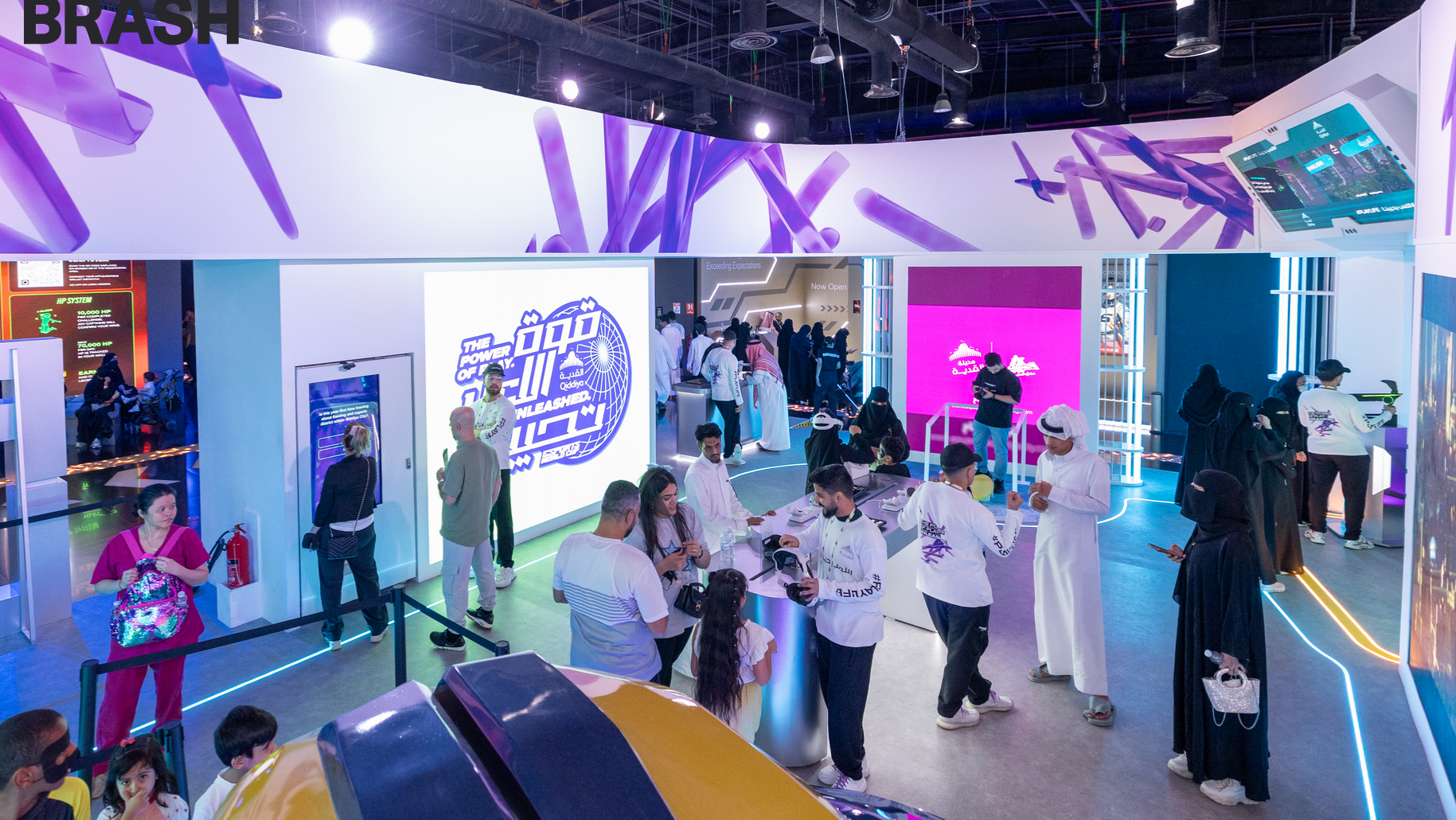
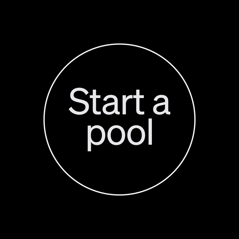
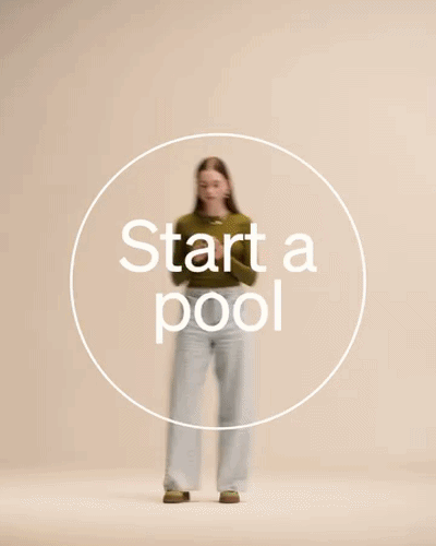
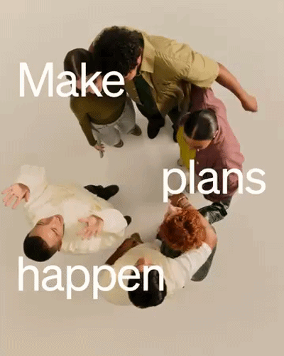
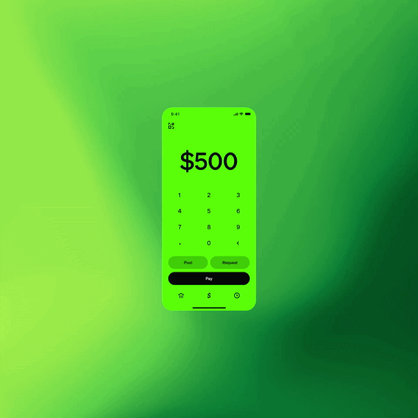
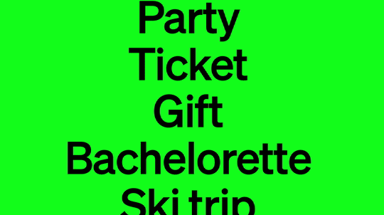
Builders Club brought me on board to create the launch motion content for Cash App's new Pools feature a group payments tool targeting Gen Z users across all major social platforms. The deliverable: a 3D animated explainer video distributed across every key social format (1:1, 16:9, 9:16, 4:3).
The challenge was not a hard constraint, but an open creative one align deeply with Cash App's established visual system while pushing the motion language further than their existing guidelines.
Tools: After Effects, Cinema 4D, Redshift
Platforms: Social Media
Credits:
Production: Builders Club
Creative Director: Alex Hill
Executive Producer: Lauren Egen
Art Director: Ali Sahba
Producer: Tom Bogda
Designers: Jose Madina, Abdul Khan, Tim Ueberall, Indrajit Sarkar,
Creative Director: Alex Hill
Executive Producer: Lauren Egen
Art Director: Ali Sahba
Producer: Tom Bogda
Designers: Jose Madina, Abdul Khan, Tim Ueberall, Indrajit Sarkar,
Callen Fisher, Artur Zhamaletdinov, Eduardo Marin.
2D Type design: Alfie Allen
2D Type design: Alfie Allen
01 Process
Discovery
Builders Club provided Cash App's existing motion and brand guidelines. No single rigid brief — the direction was to internalize the system and explore freely within and beyond it.
Concept
Over two weeks, the team generated new directions almost daily. More than 100 variations were explored across styles, 3D scenarios, and animation approaches — from on-brand executions to more experimental ones. Cash App and the agency reviewed everything and selected the direction that best fit the brand's visual DNA.
Style frames
Key frames covered gradient explorations, UI demonstration moments, and typographic animations — each tested in multiple formats before lock off.
Production
Primary tool: Cinema 4D. My responsibilities included gradient system animations, UI animations, demo animations, and text animations. The project ran with a distributed team of freelancers, each owning specific animation domains, with final delivery combining all work into one cohesive piece.
Delivery
All standard social formats delivered. I additionally produced a set of supplementary pieces, select versions of which are cleared for public portfolio use.
02 Key Creative Decision
I chose to work within Cash App's gradient system as a foundational language rather than treating it as a surface aesthetic building each animation from the gradient logic rather than applying it on top.
The obvious approach would have been to animate assets and layer brand colors over them. Instead, the gradient became the motion itself: the way color moved defined the rhythm of each piece.
This kept every frame unmistakably Cash App while giving the animation a fluidity that felt native to the brand, not borrowed.


03 Results
- Multi-format delivery across 1:1, 16:9, 9:16, and 4:3
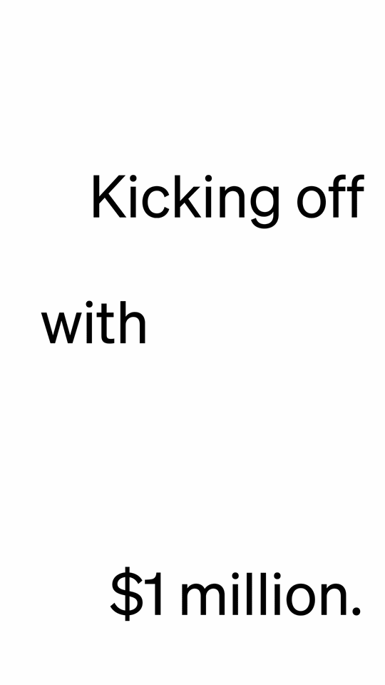
- Part of the global launch campaign for Cash App Pools distributed to Cash App's network of 57M+ monthly active users.
- Approved content across multiple rounds with Cash App's internal creative team.
- Additional pieces produced beyond original scope.
04 Conclusion
This project reinforced that working inside a strong brand system isn't a creative limitation it's a constraint that sharpens decision-making.
When the visual rules are clear, the real skill is finding the motion layer that the brand hasn't yet explored.
I've applied this thinking to every subsequent branding project: find what the brand system doesn't say in motion, and own that space.